
If you’re looking to create a beautiful turquoise color with acrylic paint, you’re in luck! Turquoise is a vibrant and eye-catching hue that can add a pop of color to any artwork. The process of mixing this color is fairly simple and can be achieved by combining blue and green pigments. By experimenting with different ratios of blue and green, you can create a range of turquoise shades, from light and subtle to deep and intense. Let’s dive into the steps to make your own stunning turquoise color with acrylic paint.
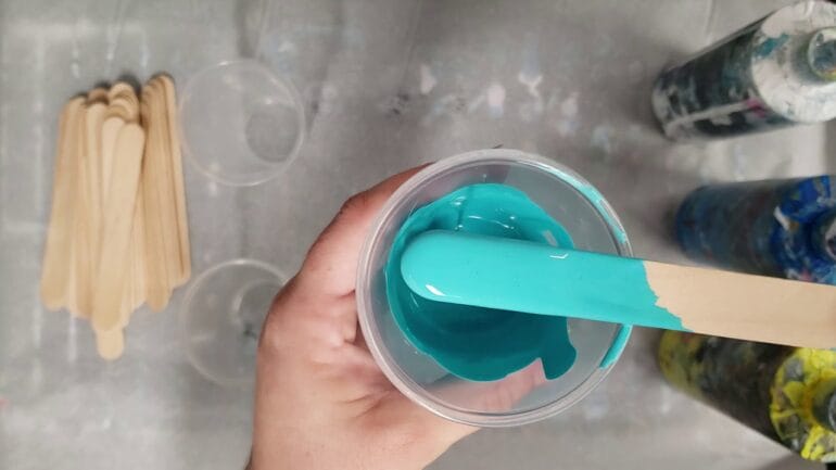
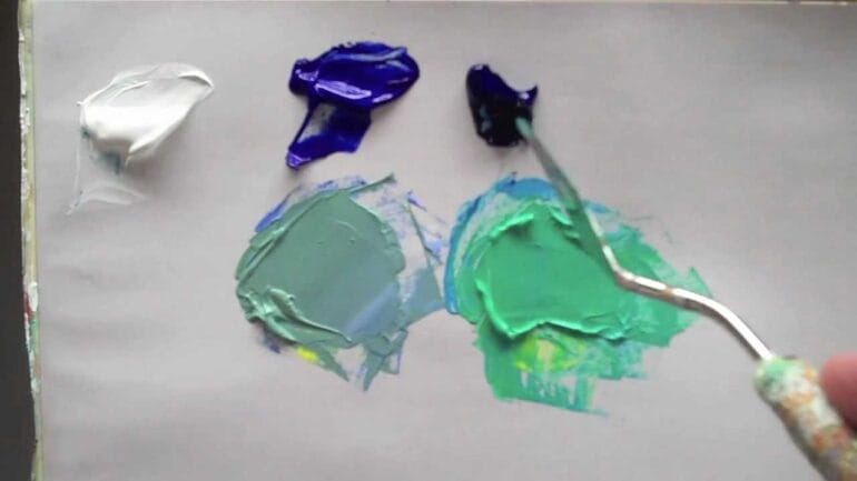
To start, gather your supplies, including a palette or mixing surface, acrylic paints in blue and green shades, and a mixing brush or palette knife. Begin by squeezing a small amount of blue paint onto your palette, followed by an equal amount of green paint. Using your brush or palette knife, gently mix the two colors together until they are well blended.
Next, assess the color you have created. If it’s too blue, add a touch of green to the mixture and continue blending. Conversely, if it’s too green, add a small amount of blue to balance it out. Remember, a little goes a long way, so it’s best to add small increments of color until you achieve the desired turquoise hue.
Continue adjusting the mix until you have obtained the perfect shade of turquoise. You may find it helpful to refer to a reference image or a physical example of turquoise to ensure you’re on the
The importance of using the right shades: Choosing the correct blue and green tones for a vibrant turquoise
When it comes to creating a vibrant turquoise color, choosing the right shades of blue and green is crucial. Turquoise, with its captivating blend of blue and green, is a color that symbolizes tranquility, calmness, and serenity. Whether you are designing a website, painting a room, or creating a piece of artwork, understanding how to achieve the perfect turquoise hue is essential.
1. Understanding the color wheel:
Before delving into the world of turquoise, it is important to have a basic understanding of the color wheel. The color wheel consists of primary colors (red, blue, and yellow), secondary colors (orange, green, and violet), and tertiary colors, which are achieved by mixing primary and secondary colors together. Turquoise is considered a tertiary color, resulting from the combination of blue and green.
2. Blue tones for turquoise:
When selecting blue shades to create turquoise, it is best to opt for those with a green undertone. These blue shades lean towards cyan or teal and have a hint of green in their composition. Examples of blue tones that can be used to achieve a vibrant turquoise include cerulean blue, turquoise blue, and aquamarine blue. These shades have a higher green content, which contributes to the final turquoise color.
3. Green tones for turquoise:
Choosing the right green tones is equally essential in obtaining a vibrant turquoise. When selecting greens, opt for shades that have a blue undertone. These green shades lean towards aqua or teal and have a touch of blue in their composition. Examples of green tones that can be utilized to create a striking turquoise include mint green, seafoam green, and aquamarine green. These shades have a higher blue content, which complements the blue tones and enhances the overall turquoise effect.
4. Experimentation and mixing:
Creating the perfect turquoise shade often involves experimentation and mixing different blue and green tones. It is essential to understand that the desired turquoise hue may vary depending on the specific project or application. By experimenting with different combinations of blue and green shades, you can achieve a customized turquoise that meets your requirements perfectly.
5. Consider the context:
While it is important to select the right blue and green shades, it is equally crucial to consider the context in which the turquoise color will be used. Factors such as lighting conditions, surrounding colors, and the intended mood or atmosphere should be taken into account. These factors can influence how the turquoise color is perceived and ensure that it harmonizes with the overall design or theme.
In summary, the importance of using the right shades of blue and green cannot be overstated when aiming to create a vibrant turquoise color. Understanding the color wheel, selecting blue tones with a green undertone, choosing green tones with a blue undertone, experimenting with mixing different shades, and considering the context are all crucial steps in achieving the perfect turquoise hue. By paying attention to these details, you can create a visually stunning and harmonious turquoise color that adds a touch of tranquility and serenity to any project or design.
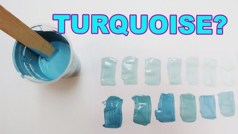
Experimenting with different ratios
When it comes to creating different shades of turquoise, one of the key factors to consider is the ratio of blue and green paint. By adjusting the amount of each color used, you can achieve varying shades of this vibrant and refreshing color.
Turquoise is known for its unique blend of blue and green hues, which gives it a captivating and tropical feel. By experimenting with different ratios of blue and green paint, you can create customized shades of turquoise that suit your artistic vision.
Here are some tips for achieving different shades of turquoise:
1. Starting with equal parts blue and green
If you’re new to mixing colors, a good starting point is to use equal parts blue and green paint. This will give you a balanced turquoise shade that is neither too blue nor too green. Mix the two colors together thoroughly to ensure a smooth and consistent hue.
2. Adding more blue
If you want a deeper and more intense turquoise, you can increase the amount of blue paint in the mixture. Gradually add small amounts of blue paint to your base turquoise color and mix well after each addition. Keep adjusting until you achieve the desired shade of turquoise.
3. Adding more green
On the other hand, if you prefer a lighter and more green-dominated turquoise, you can increase the amount of green paint. Similar to adding more blue, gradually add small amounts of green paint to your base turquoise color and mix well. Continue adjusting until you achieve the desired shade.
4. Experimenting with different ratios
Once you have a basic understanding of how adding more blue or green affects the shade of turquoise, you can start experimenting with different ratios. For example, you can try using more blue than green for a cool and calming turquoise, or more green than blue for a vibrant and tropical turquoise. The possibilities are endless!
Remember to keep track of the ratios and colors used during your experiments. This will allow you to recreate specific shades of turquoise in the future or make adjustments as needed.
By experimenting with different ratios of blue and green paint, you can unleash your creativity and discover a wide range of beautiful turquoise shades. Whether you’re painting landscapes, creating abstract art, or adding a touch of turquoise to your home decor, this exploration can lead to stunning and unique results.
Adding white for a lighter turquoise hue: Exploring the effects of adding white paint to create a pastel turquoise
Turquoise is a beautiful and vibrant color that often reminds us of the beach and tropical waters. However, sometimes you may want a softer and lighter version of this hue. By adding white paint to turquoise, you can achieve a pastel turquoise color that is perfect for creating a calming and serene atmosphere in your artwork or living space.
When white paint is added to turquoise, it has a lightening effect on the color, resulting in a softer and more subdued shade. The amount of white paint you add will determine the level of lightness and pastel quality of the turquoise.
There are several different techniques you can use to achieve the desired pastel turquoise hue. One approach is to start with a base of turquoise paint and gradually add small amounts of white paint until you reach the desired shade. This method allows you to have more control over the color and achieve a precise pastel turquoise tone.
Alternatively, you can also mix white paint with turquoise paint on a palette or mixing tray. Start by adding a small amount of white paint to the turquoise and mix it thoroughly. Assess the color and gradually add more white paint if needed until you achieve the desired pastel turquoise hue. This method is more suitable if you prefer a more spontaneous and experimental approach to color mixing.
It’s important to note that the type and brand of paint you use can also affect the outcome of the pastel turquoise color. Different brands may have slight variations in their white and turquoise shades, so it’s always a good idea to test the color on a small area or scrap paper before applying it to your artwork or wall.
Once you have achieved the perfect pastel turquoise hue, you can use it in various ways to add a touch of tranquility and elegance to your artistic projects or interior design. Pastel turquoise works well as a background color for paintings, as it creates a sense of depth and peacefulness. You can also use it as an accent color to add a pop of color to a neutral space.
In summary, adding white paint to turquoise allows you to create a lighter and more serene pastel turquoise hue. Experiment with different ratios of white and turquoise paint to achieve the desired level of lightness. Remember to consider the type and brand of paint you are using, as this can impact the final color result. Enjoy the process of exploring and creating your own unique pastel turquoise shade, and incorporate it into your artwork or living space for a soothing and tranquil ambiance.
Enhancing the Depth with Complementary Colors
When it comes to adding depth and dimension to your designs, one effective technique is to use complementary colors. Complementary colors are hues that are opposite each other on the color wheel and create a vibrant contrast when paired together. In the case of enhancing the turquoise shade, incorporating a touch of orange or pink can really make it pop.
Adding a warm color like orange to turquoise helps to create an energetic and eye-catching combination. The vividness of orange complements the coolness of turquoise, resulting in a visually striking contrast. This combination can work well in various design contexts, from graphic design to interior design, adding a dynamic and lively element to the overall composition.
Similarly, incorporating a hint of pink to turquoise can also enhance its depth and appeal. Pink is a warm and delicate color that complements the coolness of turquoise. The combination of these two colors creates a harmonious blend, balancing the vibrancy of the turquoise and the softness of the pink. This pairing can evoke a sense of femininity and elegance, making it ideal for designs aimed at a feminine audience or projects that require a touch of sophistication.
When using complementary colors to enhance the depth of the turquoise shade, it’s important to find the right balance. Adding too much of the complementary color can overpower the turquoise and detract from its unique characteristics. Instead, opt for subtle touches or accents of orange or pink to create a harmonious balance and draw attention to the turquoise.
Consider incorporating the complementary color in elements such as typography, graphics, or accents within the design. For example, using an orange or pink font for headings or important information can create a focal point and draw the viewer’s eye to the turquoise elements. Additionally, adding splashes of orange or pink in the form of shapes, patterns, or brush strokes can create visual interest and enhance the overall composition.
Remember that the goal is to enhance the depth of the turquoise shade, not overshadow or overpower it. The complementary colors should act as supporting elements that bring out the best in the turquoise, creating a visually appealing and well-balanced design.
1. How can I make turquoise color with acrylic paint?
To make turquoise color with acrylic paint, you can mix equal parts of blue and green paint together. Start with a small amount of each color on your palette, and gradually add more of each until you achieve the desired shade of turquoise. Mix the colors thoroughly to ensure an even and consistent color.
2. Are there any other ways to create turquoise color?
Yes, there are other ways to create turquoise color with acrylic paint. You can start with a base of blue paint and gradually add small amounts of green paint until you reach the desired shade. You can also use a pre-mixed turquoise paint from your local art supply store.
3. Can I lighten or darken the turquoise color?
Yes, you can lighten the turquoise color by adding a small amount of white paint to it. To darken the color, you can add a touch of black paint or another darker shade of blue or green. Remember to add these colors in small increments and mix well to achieve the desired shade.
Conclusion
In conclusion, creating a vibrant turquoise color with acrylic paint is an exciting and accessible process. By blending blue and green paints, you can achieve a range of turquoise shades, from light and airy to deep and intense. Experimenting with different ratios of blue and green will allow you to customize your turquoise to suit your preferences. Additionally, adding white to your mixture can create variations in opacity and undertones. Whether you’re a beginner or an experienced artist, the versatility and versatility of acrylic paint make it a fantastic medium for exploring and achieving the perfect turquoise hue.